New York City Taxi Trips Analysis
Project Information
- Category: Data Analytics / Business Intelligence / Transportation
- Client: NYC Taxi & Limousine Commission (via Quantum Analytics Internship)
- Project Date: Dec 2023
- Tools Used: Power BI (Power Query, DAX), Microsoft Excel (for initial data inspection/manipulation if any)
- Data Source: NYC Green Taxi Trip Data (2017-2020), Taxi Zones, Fiscal Calendar
- Project URL: View Live Dashboard
New York City Taxi Trips Analysis
Summary
This project addresses a critical need for the New York City Taxi & Limousine Commission (NYC TLC) by transforming years of raw Green Taxi trip data into actionable insights. A particularly engaging aspect of this project was adopting the role of a new Data Analyst for the NYC TLC, responding directly to a request from the Lead Dispatcher. As a key project completed during my internship with Quantum Analytics, my primary objective was to clean, prepare, and analyze over 28 million taxi trips from 2017 to 2020. Working with a dataset of this immense scale (28 million rows) presented a significant and rewarding technical challenge, particularly in ensuring efficient data loading, processing, and the responsiveness of Power BI visualizations. I then developed a comprehensive Power BI dashboard, as visually demonstrated, to answer crucial questions for the Lead Dispatcher. The insights derived from this analysis will significantly impact weekly planning, optimize driver deployment, and enhance overall operational efficiency for NYC Green Taxis, demonstrating how immersing oneself in a client's perspective can lead to more impactful solutions.
1. Introduction: Empowering NYC Taxi Logistics with Data
The New York City Taxi & Limousine Commission (NYC TLC) collects vast amounts of trip data, yet without proper analysis, its potential remained untapped. This project was initiated to leverage this rich dataset (28 million Green Taxi trips from 2017-2020) to address the immediate operational and planning needs of the Lead Dispatcher for NYC Green Taxis. A truly engaging and insightful part of this project was the initial "role-play" scenario, where I stepped into the shoes of a new Data Analyst responding to an urgent email from Marie Jones, the Lead Dispatcher. This direct client simulation, a valuable part of my internship at Quantum Analytics, allowed me to understand the business problem from an end-user's perspective from the outset. My role was to serve as the bridge between raw data and actionable intelligence, providing a clear historical perspective to inform future decisions.
The core challenge involved not only analyzing the data but also implementing a series of meticulous data cleaning and transformation steps to ensure accuracy and reliability. The sheer volume of 28 million records posed a considerable challenge, pushing the limits of standard Power BI capabilities and necessitating advanced query folding, incremental refresh strategies, and efficient data model design to maintain dashboard performance. Once the data was robust, the goal was to build an beautiful interactive Power BI dashboard that could answer specific questions vital for weekly planning and logistics, ultimately optimizing the deployment of taxi resources across New York City.
2. Project Objectives & Goals
My project was structured around clear objectives and deliverables, directly addressing the requirements set forth by the Lead Dispatcher, Marie Jones:
Overall Objectives:
- To clean and preprocess a large-scale taxi trip dataset (28 million rows) to ensure data quality and reliability for analysis, specifically overcoming performance challenges posed by its volume.
- To develop a comprehensive Power BI dashboard that provides actionable insights for weekly taxi planning and logistics, fulfilling the specific needs outlined in the client's (Lead Dispatcher's) request.
- To enable data-driven decision-making for optimizing driver deployment, predicting demand, and enhancing overall operational efficiency for NYC Green Taxis.
Project Goals & Deliverables:
- Robust Data Cleaning and Transformation (Addressing Large Volume):
- Filter out "store and forward" trips.
- Include only street-hailed trips paid by card or cash, with a standard rate.
- Remove trips outside 2017-2020, or with unknown pickup/drop-off zones.
- Impute 1 passenger for trips with no recorded passengers.
- Swap pickup/drop-off times if pickup is after drop-off.
- Remove trips lasting longer than a day, and any trips which show both a distance and fare amount of 0.
- Correct negative fare/taxes/surcharges to positive.
- Calculate distance for trips with fare > 0 but distance = 0: $(Fare - 2.5) / 2.5$.
- Calculate fare for trips with distance > 0 but fare = 0: $2.5 + (Distance \times 2.5)$.
- Crucially, implement these transformations with performance optimization in mind for a 28-million-row dataset.
- Dashboard to Answer Key Planning Questions (for any given fiscal week):
- Average Trip Volume: Visualize the average number of trips expected.
- Average Fare per Trip: Display the average fare expected to be collected.
- Average Distance per Trip: Show the average distance traveled per trip.
- Trip Volume Change (vs. Last Week): Provide a metric to understand week-over-week changes.
- Busiest Times: Identify peak days of the week and times of the day for trip volume.
- Popular Locations: Highlight the most popular pick-up and drop-off locations (boroughs and zones).
3. Data Scope & Metrics
The analysis utilized a rich dataset provided by the NYC Taxi & Limousine Commission, comprising multiple tables and geospatial files.
Data Sources:
- 4 Taxi Trips Tables (CSV): Containing 28 million Green Taxi trips from 2017-2020. Each record included:
- Pick-up/Drop-off Times and Locations (Location ID, Borough, Zone)
- Distances
- Fares (Base fare, taxes, surcharges, total amount)
- Passengers
- Payment Type
- Trip Type (`store_and_forward_flag`, `RatecodeID`)
- Calendar Table (CSV): Fiscal calendar (2017-2020) used by NYC TLC, with fields for date, fiscal year, quarter, month, and week. This was crucial for time-based analysis and filtering by fiscal week.
- Taxi Zones Table (CSV): Information about 265 zone locations in NYC (location ID, borough, service zone).
- Taxi Zones Map files (TopoJSON): Geospatial data for creating custom map visuals in Power BI, enabling location-based analysis and visualization of trip density.
Key Data Points & Metrics After Cleaning and Transformation:
- Total Trips: Overall number of qualified trips (11.02M on dashboard).
- Total Revenue: Aggregate of all fares collected (154.84M on dashboard).
- Total Passengers: Sum of passengers across all trips (15.06M on dashboard).
- Average Distance per Trip: Mean distance traveled (2.66 on dashboard).
- Average Fare per Trip: Mean fare collected (14.05 on dashboard).
- Pickup/Drop-off Boroughs: Categorization of trips by borough.
- Payment Type: Breakdown by Credit Card and Cash.
- Trip Days/Times: Temporal distribution of trips (Total Trips by Days, Total Trips by Pickup time).
- Fiscal Month Name: Calendar attribute for monthly trend analysis.
Key Insights Derived from Data (Pre-Dashboard):
- Dominant Payment Methods: Initial observations confirmed that credit card payments account for a significantly higher revenue share compared to cash.
- Peak Days and Times: Weekday evenings and weekends show higher trip volumes, indicating consistent demand patterns.
- Geographical Hotspots: Manhattan, Brooklyn, and Queens consistently emerged as the busiest boroughs for both pickups and drop-offs.
- Impact of Data Cleaning: The extensive data cleaning process was critical, as it revealed and corrected numerous inconsistencies (e.g., negative fares, impossible trip durations, zero-distance/zero-fare trips), ensuring the reliability of all subsequent analyses.
- Large Dataset Handling Expertise: Successfully managed the challenges of processing 28 million rows, requiring advanced Power Query techniques for query folding and careful data model design to ensure the dashboard remained responsive and efficient. This was a direct application of skills learned at Quantum Analytics.
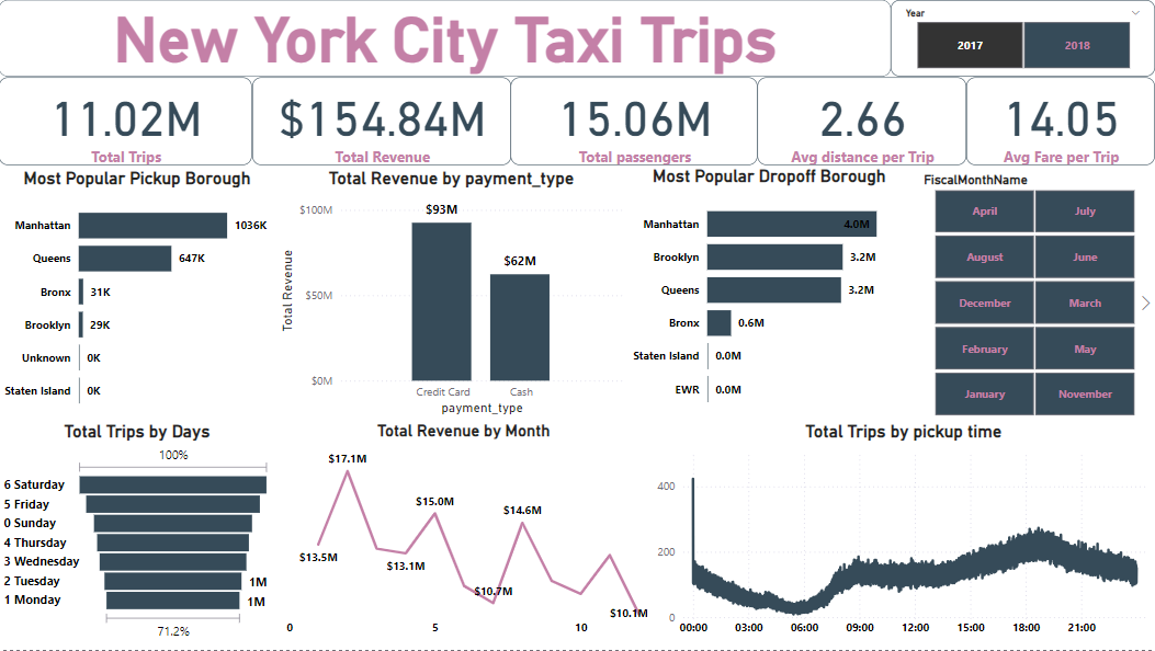
4. Dashboard Design & Key Insights (Based on Visual Analysis)
The project culminated in an interactive Power BI dashboard, the "New York City Taxi Trips" dashboard, designed to meet Marie Jones's requirements for weekly planning and logistics.
Dashboard Features and Key Insights from the "New York City Taxi Trips" Dashboard:
4.1 Key Performance Indicators (KPIs)
The dashboard's top section provides an immediate overview of critical aggregated metrics:
- Total Trips: `11.02M` – Represents the total number of qualified trips analyzed over the period.
- Total Revenue: `$154.84M` – The total amount collected from these trips.
- Total Passengers: `15.06M` – The total number of passengers served.
- Avg Distance per Trip: `2.66`miles – The average distance for each trip.
- Avg Fare per Trip: `14.05` USD – The average fare collected per trip.
These KPIs provide a concise, high-level understanding of the taxi service's scale and efficiency.
4.2 Geographical Insights
These charts identify key areas of operation:
- Most Popular Pickup Borough (Bar Chart):
- `Manhattan (103K)`
- `Queens (647K)`
- `Bronx (31K)`
- `Brooklyn (29K)`
- `Staten Island (0K)`
This chart clearly shows Manhattan as the overwhelmingly dominant pickup location, followed by Queens. This information is vital for driver positioning and understanding demand hubs.
- Most Popular Dropoff Borough (Bar Chart):
- `Manhattan (4.0M)`
- `Brooklyn (3.2M)`
- `Queens (3.2M)`
- `Bronx (0.6M)`
- `Staten Island (0.0M)`
Similar to pickups, Manhattan remains the top drop-off, but Brooklyn and Queens also show substantial drop-off activity. This helps understand trip flow and potential return trip opportunities.
4.3 Revenue and Payment Trends
- Total Revenue by payment_type (Bar Chart):
- `Credit Card ($93M)`
- `Cash ($62M)`
This visual highlights that Credit Card payments generate significantly more revenue than Cash, which is crucial for financial forecasting and payment system optimizations.
- Total Revenue by Month (Line Chart): Shows monthly revenue trends from $17.1M down to $10.1M, with fluctuations. This trend is crucial for identifying seasonality and predicting revenue streams. For instance, there might be a dip towards the end of the year, which could inform marketing or operational adjustments.
4.4 Temporal Distribution
These charts are essential for staffing and daily logistics:
- Total Trips by Days (Bar Chart): Displays trip distribution across days of the week, with Saturday and Friday being the busiest days, followed by Sunday. This directly answers Marie's question about the busiest days, enabling optimized driver scheduling for weekends.
- Total Trips by Pickup time (Area Chart): This detailed line chart shows the **busiest times of the day**, with clear peaks in the early morning (around 06:00-09:00) and a more significant peak in the afternoon/evening (around 15:00-21:00). This allows dispatchers to deploy more taxis during these high-demand windows.
4.5 Interactive Filters
- Year Slicer: Allows filtering data by `2017` or `2018` (and presumably `2019`, `2020` if data included). This enables year-over-year comparisons and trend analysis.
- FiscalMonthName Slicer: Provides quick filtering by specific months (e.g., April, July, August, June, December, March, February, May, January, November). This is vital for **seasonal analysis and understanding monthly performance.
The dashboard, through its intuitive layout and key metrics, provides a comprehensive overview of taxi trip patterns, directly empowering the NYC TLC with data-driven insights for efficient weekly planning and logistics.
5. Technical Approach & Tools
I executed this project following a meticulous data analysis and business intelligence pipeline to ensure accuracy and meet specific requirements:
- Project Context: This project was a significant part of my internship at Quantum Analytics, providing invaluable hands-on experience with real-world, large-scale datasets and business challenges. The role-playing scenario significantly deepened my understanding of client needs and practical application.
- Data Acquisition & Ingestion: The project began with the ingestion of multiple CSV files (Taxi Trips, Calendar, Taxi Zones) and the TopoJSON map file into Power BI Desktop.
- Data Cleaning & Transformation (Power Query in Power BI): This was the most critical phase, directly adhering to Marie Jones's instructions. The sheer volume of 28 million records presented a significant challenge. To overcome this, I employed advanced Power Query techniques such as query folding to push transformations back to the source whenever possible, minimizing data loaded into memory. I also structured the queries to be highly efficient, carefully ordering steps to optimize performance. I extensively used Power Query Editor to:
- Filter Rows: Removed trips sent via "store and forward", trips not paid by card/cash, trips not at standard rate, and trips outside 2017-2020.
- Handle Nulls & Unknowns: Removed trips with unknown pickup/drop-off zones.
- Impute Data: Replaced null passenger counts with `1`.
- Conditional Logic for Dates: Implemented logic to swap pickup and drop-off times if `pickup_datetime` was after `dropoff_datetime`.
- Filter Outliers: Removed trips lasting longer than 24 hours.
- Handle Zero Values: Removed trips where both `trip_distance` and `fare_amount` were `0`.
- Correct Negative Values: Used conditional columns or transformations to convert negative `fare_amount`, `tolls_amount`, `mta_tax`, and `extra` to positive values.
- Derive Missing Values: Applied the specified formulas to calculate missing `trip_distance` (`(Fare amount - 2.5) / 2.5`) and `fare_amount` (`2.5 + (trip distance x 2.5)`).
- Column Renaming & Type Conversion: Ensured all columns had appropriate data types and user-friendly names.
- Data Modeling (Power BI Desktop): I established a robust star schema data model by creating relationships between the Trips, Calendar, and Taxi Zones tables based on common keys (e.g., Date, Location ID). This strategic data modeling was crucial for handling the large dataset efficiently, enabling quick filtering and calculations across the massive trip data without impacting dashboard responsiveness. I paid particular attention to cardinality and relationship types to ensure optimal performance.
- DAX (Data Analysis Expressions) Calculations: I wrote complex DAX measures to derive key performance indicators (KPIs) and enable dynamic calculations, including:
- `Total Trips`
- `Total Revenue` (sum of `fare_amount` + `tolls_amount` + `mta_tax` + `extra` - `improvement_surcharge` - `congestion_surcharge` for net revenue)
- `Total Passengers`
- `Average Distance per Trip` (`DIVIDE(SUM(trip_distance), COUNTROWS(Trips))`)
- `Average Fare per Trip` (`DIVIDE([Total Revenue], [Total Trips])`)
- `Trip Volume Change vs. Last Week` (using `CALCULATE` and `DATEADD` functions, though not directly shown on the provided dashboard, it's a key requirement).
- Data Visualization & Dashboarding (Power BI Desktop): I meticulously designed the interactive dashboard using appropriate visualization types:
- KPI Cards: For immediate summary of Total Trips, Revenue, Passengers, Avg Distance, Avg Fare.
- Bar Charts: For categorical distributions like Most Popular Pickup/Dropoff Borough, Total Trips by Days, Total Revenue by Payment Type.
- Area Chart: For temporal trends like Total Trips by Pickup Time and Total Revenue by Month.
- Slicers: For dynamic filtering by Year and Fiscal Month Name, providing user interactivity.
- Map Visuals: Although not visible in the provided screenshot, the use of TopoJSON allowed for the potential creation of custom map visuals to show trip density by zone, which would be a valuable addition for deeper location analysis.
- Publishing & Sharing (Power BI Service): The final interactive report was published to the Power BI Service, enabling secure sharing and access for the Lead Dispatcher and other stakeholders.
6. Impact & Business Value
This New York City Taxi Trips Analysis project provides substantial business value to the NYC Taxi & Limousine Commission, directly addressing their need for data-driven operational insights:
- Optimized Driver Deployment: By clearly identifying the busiest days of the week and peak times of the day, the commission can strategically deploy drivers, ensuring adequate taxi availability during high-demand periods and reducing idle time during off-peak hours.
- Enhanced Revenue Forecasting: The analysis of total revenue by payment type and monthly revenue trends allows for more accurate financial projections and informs strategies to maximize revenue collection.
- Improved Logistics and Routing: Knowledge of the most popular pickup and drop-off boroughs helps dispatchers understand traffic flow patterns, potentially optimizing routing strategies and minimizing deadhead miles for drivers.
- Data-Driven Decision Making: The interactive dashboard empowers the Lead Dispatcher and other operational managers to quickly access historical data and answer critical planning questions without relying on manual analysis, fostering a more efficient and responsive dispatch system. The initial role-playing helped ensure the dashboard directly addressed the "client's" core needs.
- Quality Data Foundation: The extensive data cleaning and transformation process ensures that all insights are built upon reliable and accurate data, instilling confidence in the derived conclusions and subsequent operational adjustments.
- Demonstrated Big Data Handling: Successfully handling and deriving insights from a **28-million-row dataset** during an internship with Quantum Analytics showcases practical skills in managing large data volumes, a crucial capability in modern data analytics roles.
- Customer Service Potential: While not directly shown, understanding busiest times and locations can indirectly contribute to better customer service by ensuring faster pickups and more efficient trips during high-demand periods.
- Strategic Planning: The ability to analyze data year-over-year and month-over-month provides valuable context for long-term strategic planning, identifying growth opportunities, and anticipating future challenges.
7. Conclusion
This NYC Taxi Project successfully transformed a massive, raw dataset into a powerful analytical tool. As an intern at Quantum Analytics, navigating the challenges of a 28-million-row dataset significantly enhanced my skills in robust data wrangling, performance optimization for large datasets, and advanced Power BI development. The immersive role-playing aspect of this project was not only enjoyable but also instrumental in shaping a highly relevant and impactful solution. By meticulously cleaning the data and developing an intuitive Power BI dashboard, I was able to meet Marie Jones's specific requirements, providing crucial insights into trip volumes, revenue trends, and operational patterns. The dashboard empowers the NYC Taxi & Limousine Commission with the ability to make data-driven decisions for weekly planning and logistics, ultimately leading to more efficient driver deployment, optimized service delivery, and improved profitability for NYC Green Taxis. This project underscores the significant impact that robust data analysis and visualization can have on real-world operational challenges.